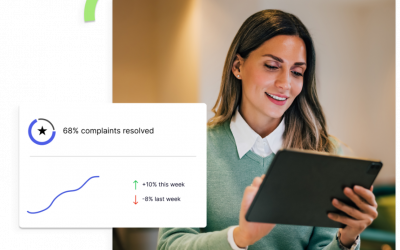
When you find the right data visualization tool for your business you can take the guesswork out of decisions, increase your efficiency across the board, and use those data insights to personalize customer experiences. Just one of these benefits can positively impact your company’s profitability.
Data analytics can give your organization a competitive edge, but to get that edge you have to be able to find and visualize what your data is trying to tell you. Furthermore, it can be a challenge to present the data to users in a way that they can quickly consume and understand.
What is Data Visualization?
Taking your data and representing it in graphics including charts, tables, and graphs is the basic premise of data and information visualization. At the bare minimum your data visualization workflow and software should be able to present these types of visuals in an intuitive dashboard.
When complex data is showcased in this way, with the ability to customize visuals and drill down into the meanings behind the data, it allows data analytics consumers (you and your team, in this case) to understand complex relationships quickly.
How to Choose the Right Data Visualization Tool for Your Team
There are a few things to keep in mind when you’re evaluating a data visualization tool or software platform.
Ask yourself these questions as you compare different tools and platforms:
- Are the charts and graphs the system uses right for your business?
- Can you adapt or customize the reports this tool offers?
- Do the provided reports highlight the most important information to save time?
If you’re interested in a data visualization tool and either have more questions or want to see the tool before making an investment, ask for a demo. This will help you get insight into how the tool will work for your teams and whether or not it has everything that you need. Offering a demo is a standard practice for software providers, so don’t be shy about requesting a one-on-one demo before signing a contract.
Other Considerations When Choosing a Visualization Tool for Your HR Team
Sources of Data
Beyond the visual aids your chosen data visualization tool can create, there are other necessary considerations for evaluating new software commitments. One thing that is paramount—and completely unique for HR teams—is the number of data sources a platform can pull data from. While there are a few big players in terms of data storage for HR teams, the combination of workflow and platforms can almost be as unique as a fingerprint to every team. Getting input from the people who will use the data visualization tool every day is critical because they should be deeply familiar with the workflows and platforms that will need to be involved.
Scalability
With that in mind scalability is a major consideration for new software agreements. Understand how the tool will change and grow as your team’s processes mature. Volume changes are also something to keep in mind. Is your business growing or changing rapidly? A data visualization software will have to be nimble and user-friendly enough to keep up with these changes to be a good long-term solution for your business.
Automation
Automation is on everyone’s mind when speaking about software, and for good reason. Closely consider the time savings for your team with automations in data visualization processes. How many hours per week or month could you give your HR team back that they currently spent formatting and editing visual data reports?
Accessibility
As technology and teams evolve, it’s also prudent to pay close attention to the devices on which a data visualization tool is available. While personal computers are standard, can the visualization tool you’re evaluating be available via smartphone apps and tablets? The more uses your team can get from a platform, the better. Having 24/7 access to your reporting through a variety of devices can help empower your team to feel confident in the reporting they’re producing and the decisions that are made on those data sets.
Collaboration
In a world of hyper-connectivity the ability to collaborate on reports is a standard benefit of many software services. Users should be able to easily generate PDF reports, Excel documentation, and any other file form your business relies on for professional, polished reports. Users should also be able to leave notes on reports. This could include internal notes regarding data on the reports or notes tagging other users for follow up actions.
Security
Security should be at the forefront of leadership and HR teams’ minds when comparing new tools. All platforms your HR team uses should protect sensitive information through multi-factor authentication (MFA) and appropriate encryption levels. While collaboration is crucial there should be role-based permissions so that users only have access to the data they need to do their jobs.
Support and Expertise
Lastly, consider whether or not the tool is just that, and only that. Does the provider offer more than the tool itself? Look for a partner that offers services to help through change management to get broader reach in the organization. If the platform you’re considering offers data science experts to help troubleshoot data, even better. Giving your team the option of exceptional support when they need it will make reporting easier and results more dependable.
Consider People in the Loop
Most companies that need data analytics to create a competitive edge or greater efficiency do not have data scientists on their staff. Consider the support that the data visualization tool provider offers. The right tool and the right support can finally give companies the insights and data ROI they’re looking for.
ZeroedIn offers services and solutions to fit any data needs. If you’re ready to see the difference that we can make for your business, let’s talk.


