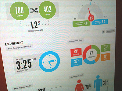
The importance of workforce and HR analytics is clear and the ways they aid in decision making are unquestionable. The question that begs is — how does the end user, in this case the management and decision makers, make use of the numbers that the analytics produce? It is true that not all managers are well versed in statistics, and making use or even sense of what is essentially just a long list of values marked against variables can be a difficult task. And the results can be confusing to new managers lacking experience with the business. Enter the dashboard — the perfect tool for making ‘big data’ understandable.
Dashboards
Dashboards are representations of results; they can be in the form of charts, reports, slides or even infographics. Scorecards are often used to display the progress of data over time, while dashboards show a static picture of the current period. The two of them are often converged and dashboards at times have interactive features that allow this comparison. Consider a few qualities of the top rated and most vital BI dashboard types and how they can suit HR reporting.
Design practices
Many dashboards are filled with relevant and often important data, but are not presented in a pleasing, easy to understand way. The very purpose of having dashboards will be defeated if they are not easy to understand. On the other hand, it also does not mean that having a swanky design that looks amazing can make up for lack of good analytics or incomplete data. Finding the right balance between style and substance is key.
Delivery practices
Modern day dashboards are normally interactive. They may have movable charts, graphics and interfaces that can be manipulated and personalized, and are even more useful when the user can drill down into various levels. The best way to deliver these type of dashboards are through the web. Web based dashboards also have the advantage of real time updates and can be invaluable during times of crisis handling. Dashboards implemented as slide decks have the risk of becoming out of date quickly. They also prove tedious to recreate time over time.
Display practices
The first sign of an effective dashboard is having it all in one screen. It can be challenging especially when there are a number of metrics to be displayed. Having a long scrolling dashboard can increase confusion for the user, having to go back and forth to view different aspects. If there are multiple pages, that is good, but having the same information spread out across pages is not advisable. Another best practice is to have the data represented in such a way that what is seen first is the most important, with an overall summary of the data below it. In other words, first show what is happening, followed by why it’s happening.
The above mentioned pointers are not the only things to be kept in mind. Dashboards have to flow naturally between charts, with a kind of coherence that places everything in the way they would normally be expected. A logical order and a consistent theme throughout will make the entire presentation a lot more engaging and do justice to the immense amount of analysis that has happened with the raw data in the background. When HR dashboards are designed in the same way BI dashboards are formed, they will be a lot more intuitive and effective.


